
Let’s be honest. Counting participants in youth sports is like judging a restaurant by its number of chairs. It tells you nothing about the meal.
The stats, though, show we need a better approach. Up to 80% of kids quit sports by age 15. Adolescent girls drop out at six times the rate of boys. We face an obesity crisis and a culture that values winning over fun.
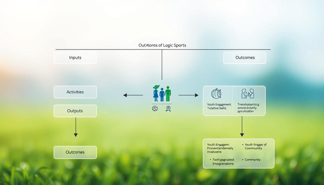
It’s time to move beyond old metrics. Enter the logic model. Think of it as the blueprint for your change theory.
This isn’t just about managing projects. It’s about fighting for social justice. It shows how inputs like coaches and funding lead to meaningful outcomes like resilience and health.
Take the ReThink Sport Project. It’s a 7-year, 65-partner effort to change sports for the better. It’s a playbook for making a real difference.
Selecting Equity-Centered KPIs
When your KPIs ignore who’s being excluded, you’re not measuring impact—you’re measuring privilege. It’s like applauding a concert hall for its acoustics while ignoring that half the audience can’t afford tickets. Traditional sports metrics—participation numbers, win-loss records, tournament trophies—are the low-hanging fruit of measurement. They’re easy to pick, but they tell you nothing about the soil’s health.
We’re in an era where equity isn’t a sidebar; it’s the main event. Your key performance indicators need a conscience. This means ditching the comfort of pure quantification and wading into the beautiful mess of qualitative data. Are you tracking which kids show up, or are you measuring which kids feel like they belong?
Let’s get specific. Say you run a basketball program in a diverse urban neighborhood. Your old KPIs might have been: 120 registered players, 4 tournament wins, 90% attendance rate. Solid numbers. Now, let’s apply an equity lens. What percentage of those 120 players are girls from racialized communities? Of those girls, how many report feeling like valued team members versus just warm bodies filling jerseys? How many have moved from participant to assistant coach? That’s where the real game is played.
The ReThink Sport Project offers a masterclass in this shift. They didn’t just want diverse voices in the room; they wanted those voices to actually shape the architecture. Their approach centered on two powerful frameworks:
- A Diversity Skills and Competency Matrix: This wasn’t your typical checkbox exercise. Rooted in EDI (Equity, Diversity, and Inclusion) principles, this matrix guided their advisory group recruitment. They looked for specific lived experiences and community knowledge, not just titles or affiliations.
- Separate Youth and Sport Leader Collectives: Recognizing that power dynamics silence voices, they established distinct groups. This simple structural choice minimized the “adult knows best” imbalance, creating safer spaces for genuine youth input.
Their primary KPI? Feelings of belonging among underrepresented groups. Not just physical access, but emotional and psychological access. They understood that a girl from a lower-income background might technically have a spot on the team, but if she’s sidelined during strategy talks or can’t afford the unofficial team gear, her “participation” is a statistical fiction.
This is the fundamental pivot: from counting bodies to evaluating experiences. Your new KPIs should answer tougher questions:
- How are we quantifying meaningful access beyond mere facility entry?
- What systems track progression of underrepresented participants into leadership roles?
- Do our feedback mechanisms capture the silent disengagement of those who feel like outsiders?
Implementing these equity-centered KPIs requires admitting something uncomfortable: some of your current data is useless. A registration form that doesn’t collect socioeconomic data can’t reveal class barriers. A survey that only asks “Were you satisfied?” won’t uncover nuanced exclusion.
The ReThink Sport model shows us that the right KPIs act as both a mirror and a blueprint. They reflect your current equity landscape with brutal honesty, and they map the specific changes needed. It’s the difference between checking a diversity box and actively dismantling the systems that made the box necessary in the first place.
Your KPIs should make you slightly nervous. If they’re too easy to achieve, you’re not aiming high enough. The goal isn’t to fill rosters with diverse faces—it’s to build a culture where every face knows it truly belongs. That’s a metric worth chasing.
Simple Data Collection Systems
Let’s clear up a big myth in social impact work: data collection doesn’t have to be hard. You don’t need a PhD or expensive software. The key is to create a system that’s so easy, it’s hard not to use it.
Think of it like a daily weather app. You check it easily because it’s simple and gives you what you need. Your program evaluation should be just as easy to use.

The alternative is “data debt.” This is when you launch a big survey but never use the results. It’s like a digital tomb, not a useful tool.
Good evaluation is about being consistent and clear, not complicated. Look at the MLSE Foundation’s “Change the Game” research. They didn’t get big by accident. They embedded surveys in their programs and got insights from over 12,000 Ontario youth.
Their success wasn’t just about the numbers. It was about focusing on what really matters to kids. They asked about belonging, safety, and body image. This data was used to help coaches and organizers make real changes.
This vision is about creating a “national sport data infrastructure.” It’s not about a big, complicated system. It’s about a network of simple systems that give you quick insights. Imagine knowing right away if your efforts are working, not guessing later.
So, how do you start? Swap the big survey for regular checks. Ask three good questions every month instead of thirty hard ones at the end. This creates a constant feedback loop.
This is like the difference between an annual physical and a fitness tracker. One gives you a report from the past. The other gives you data you can act on now. Your evaluation becomes a conversation, not an interrogation.
Set up your digital “coffee chat.” Use a simple form tool linked to a central spreadsheet. Automate it. The moment someone answers, the data shows up in your tracker. No manual entry needed.
This simple system changes how you work. You go from guessing to knowing. You stop seeing your program as a past event and start guiding it with real-time feedback. That’s how you use data to drive real change.
Pre/Post Surveys and Observation Rubrics
Self-reported data is just the beginning. It’s like watching a movie trailer and then reading the critic’s review. To really evaluate your program, you need pre/post surveys and observation rubrics.
Pre and post surveys show how participants grow. They measure self-confidence and how much fun they have. This data proves your program does more than just build muscle.
But, people often don’t tell the whole story. A kid might say they had fun, but not really. That’s where observation rubrics come in.
Think of it as an outside view. It helps you see things you might miss. It’s a guide to note how inclusive a coach is or how much kids interact.
When you combine self-reported data with observed behaviors, you get real insights. You go from “The kids seemed happier!” to “Coach positivity scores increased 40%.” This shows that fun is key, tied to positive social interactions and effective coaching.
| Tool | What It Measures | Key Insight | Best For |
|---|---|---|---|
| Pre/Post Surveys | Internal states: confidence, enjoyment, perceived skill, sense of belonging. | Reveals the participant’s personal journey and emotional impact. | Capturing the “why” behind engagement and tracking growth over time. |
| Observation Rubrics | External behaviors: coach feedback quality, peer interactions, body language, inclusion metrics. | Provides objective, real-time data on program delivery and social dynamics. | Assessing program fidelity, coach performance, and environmental factors. |
Together, these tools make your evaluation much stronger. They help you understand not just if something worked, but how and for whom. Using standardized evaluation processes is key to getting consistent, useful feedback. It’s the difference between a plain cheese pizza and one with the perfect toppings.
Story + Data Reporting
You’ve collected the data, but how do you turn those metrics into a movement? Raw numbers are inert. A pie chart won’t rally your board. A spreadsheet has never inspired a donor.
Yet, a story without data is just a nice anecdote. It lacks the heft to change minds or open wallets. The real magic, the persuasive alchemy, happens in the blend.
Your job is to become a narrative architect. This means taking the cold, hard statistic—say, a 20% increase in girls reporting a sense of belonging—and fusing it with the warm, human story of a specific participant.
Think of “Samira,” who went from sitting silently on the bench to leading the team warm-up. The number proves the trend. Samira’s story makes it matter. Together, they create an undeniable case for your program’s impact.

This is the essence of creating action-oriented reports. We’re not talking about PDFs that gather digital dust. We’re talking about documents designed to mobilize people and resources.
Take a cue from models like the ReThink Sport Project. Their focus isn’t on hoarding data. It’s on transforming unique research findings into user-informed toolkits and narratives that directly drive policy and practice.
Their reporting has a “so what?” baked right in. It provides clear, user-informed interpretations that tell stakeholders exactly what to do next.
This approach shifts reporting from an autopsy—a look at what already happened—to a call to action. It answers the donor’s silent question: “What will my money actually do?” It shows the coach the tangible measurable outcomes of their inclusive philosophy.
Your final report shouldn’t just list findings. It should tell a compelling story with the data as its supporting evidence. Frame your quantitative results with qualitative quotes. Use participant photos or short video clips alongside your graphs.
This blend makes your outcomes feel real, urgent, and worthy of investment. It’s how you move people from passive readers to active partners in your mission. In the end, the most powerful reports don’t just inform. They transform.
Continuous Improvement Cycles
Forget the post-mortem. The future of social impact in sports is about constant feedback loops. A single year-end evaluation is like reading the last page of a mystery novel. You know who did it, but you missed all the clues that could have stopped it.
Real change works on a different timeline. Think of the ReThink Sport Project. It was a seven-year journey of continuous improvement. It started with real experiences and then used those findings to create practical resources. The advisory groups didn’t just meet once. They gave ongoing, real-time advice. Outputs and outcomes were checked and updated regularly.
Your program needs its own cycle of improvement. It’s not a monument to admire. It’s software you update constantly. Here’s how to start:
- Collect: Gather data like surveys, stories, and notes all the time, not just at the end.
- Analyze: Look for patterns every month or quarter. What’s going up? What’s a warning sign?
- Adapt: This is where you make changes. Use what you’ve learned to tweak drills, change how you communicate, or add new resources.
- Implement: Put the changes into action right away. Then start collecting data on those changes.
This needs a certain kind of humility. You must always ask the MLSE Foundation’s question: “What’s getting in the way?” Your advisory board or parent council isn’t just for show. They are your real-time focus group.
Think about attrition rates. They go up during adolescence because of outside factors. A rigid annual evaluation might show you lost 30% of your 14-year-olds in December. But a continuous cycle would have seen the drop in interest by October. You could have made changes—like flexible scheduling or peer mentorship—before it was too late.
The shift is cultural. You move from seeing data as a judgment to treating it as your most strategic coach. The table below shows the difference in mindset and results.
| Aspect | Traditional Annual Review | Continuous Improvement Cycle |
|---|---|---|
| Primary Mindset | Accountability & Reporting | Learning & Adaptation |
| Evaluation Frequency | Once per year (post-program) | Ongoing, embedded in operations |
| Data Use | Historic record; justifies past actions | Real-time signal; informs immediate next steps |
| Response to Problems | “We’ll fix it next year.” | “Let’s pilot a solution next week.” |
| Impact on Culture | Creates anxiety around “the big review” | Fosters curiosity and collaborative problem-solving |
This isn’t about doing more work. It’s about doing smarter work. You’re already collecting the data. The continuous cycle just says listen to it sooner and have the courage to change. Stop writing autopsies. Start calling the plays.
Sample Dashboard Templates
All this beautiful data needs a home. Think of it as mission control for your social impact.
A great dashboard brings your logic model to life. It turns abstract goals into visual KPIs everyone can understand.
Look at the MLSE Foundation’s public dashboard. It organizes key insights across themes like Engagement and Wellbeing. This isn’t a cluttered spreadsheet. It’s a clean, visual command center.
Imagine a single screen. One section shows a map of participation rates by neighborhood. Another displays a trend line for “sense of belonging” scores from your pre/post surveys. A third feeds in recent participant quotes.
This visual setup makes your equity-centered KPIs intuitive. Coaches see immediate feedback. Board members grasp the narrative. Funders get the proof.
Your dashboard is the operational heartbeat. It connects your daily inputs to your long-term impact. It answers the question: is our theory of change actually working?
This final piece transforms evaluation from an academic report into a living, breathing tool for your team.